Showing posts with label Humour. Show all posts

Tuesday, 15 March 2022

A Few Other Series Thirteen Things...

Here's a few other items I did based on series 13. Three annuals and a game.


The Swarm and Azure annual is inspired on the 1981 Sapphire & Steel annual with the two villains posed in front of a clock like the famous publicity still of the series.


The Division annual is an original composition that features the characters as depicted in the episode "Once, Upon Time" but gives them their real faces as opposed to those of the Doctor's companions. Maybe it's bit dark looking for a kids annual but I think I've got the photoshopping on the figures right.


Jerricho at Large is one featuring the eccentric professor character played by Kevin McNally in the latter half of the series. I think it's safe to say that he was the story's stand-out guest character. This - along with the Swarm and Azure design - is available from RedBubble as a journal or notebook. I was messaged shortly after I uploaded it to the site by someone who said they were buying one as a gift for the actor. Not heard anything back yet though...


And finally, the title of episode two was 'War of the Sontarans' which got me thinking... and photoshopping... and ending up with this...


As always if you like what you see, you donate towards my upkeep by purchasing me a coffee via my Ko-fi page. Follow the link here.

TV Annuals 2022

As was usual, I produced some absurd TV annual covers for the festive season. They were done over a period of months so I probably would've ended up posting them one at a time had I been updating the blog then.

This is all of them together in one place:


This is The Pact. A classy little BBC workplace drama from Doctor Who writer and doyen of the classic series Blu-rays, Pete McTighe. A group of workmates are apparently responsible for the death of their boss and attempt to cover it up leading to conflicts and secrets being revealed. Not exactly annual material but an ideal subject for one of my covers...


Line of Duty came to a thrilling climax at the start of the year. A tour de force cast with a brilliant Jed Mercurio script turned out not to be everyone's cup of tea. Perhaps the stand-out character from the series was little 13 year old Ryan Pilkington played with deadly acid by Gregory Piper in the first series. He created a bit of a storm when he returned as not only an adult... but a copper... and a VERY bent one at that. He really should have had a spin-off series but (quite rightly to be honest) got his come-uppance in the final series. Who could forget his series one catchphrase... "Bent bastard!" 

The annul itself is based on a design used by NetworkDVD for their release of the cosy late 60s police drama 'Parkin's Patch'. 


Russell T Davies' It's a Sin told the story of the AIDS crisis seen through the eyes of a group of young people. Despite the subject matter and many harrowing scenes, it was also a joyous celebration of life... and what it means to hold onto it even if the most harrowing of times. The annual design is a reflection of the positivity that comes from Davies' pin sharp script and is based on the design style of an 80s Look-in annual. 


Last year I created a Chris Witty annual. Maybe it was going a bit too far picking out an individual to represent the global pandemic. Having said that, it's one of the journals that has sold a few copies on RedBubble. Some shyster even pinch the design and put it on their RB store... This year I did something more generic and used the 1980 Blake's 7 annual as my inspiration. Quite pleased at my attempt on the logo! 


This is one I should've done ages ago - a period-style annual for Endeavour. Not specifically based on any published book or series although it does take elements from the World Distributors annuals. (I think I may have put a non-contemporary logo on it!) The police car is actually a publicity still from 60s Z Cars. Russell Lewis "liked" this when I tweeted it.


When season two of 'Star Trek Discovery' ended, I was one of those who quite rightly saw that a Captain Pike spin-off was the most logical outcome of his appearance in the series. I even did a few period book covers and designs showcasing the concept. It took Paramount and CBS a year or so but they got there and the series debut in a few short months. This is just a design using what few images were available of the main cast in their correct costumes (and haircuts). The image of the USS Enterprise is a bit of a cheat as it's actually a commercially available scale model... but they did that on the original Star Trek series didn't they?


The Covid 19 and It's a Sin annuals are available as journal and notebooks on RedBubble. Follow the link.


If you've enjoyed these designs, show your appreciation with a coffee purchased via my Ko-fi page. Follow the link.

Friday, 11 June 2021

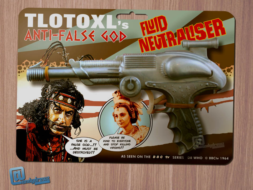
Some more 60s Doctor Who Toys

During the early part of the second lockdown, I put together a few more silly 60s Doctor Who toys. All of them are based on actual products. 

I love the packaging designs from that period. Not constrained by the ideals of a brand bible, they had free-reign to do what they liked. 

Sometimes it worked. Sometimes it didn't. Sometimes it was a cheap generic design. Other times it was a work of art. Nothing was ever the same. 

Here's a few of the ones I did. If you know your merchandise, you'll probably be able to spot the source material...


Textless cover image


If you've enjoyed viewing this page, then you can show your appreciation by purchasing my a coffee via my Ko-fi account here. Thank you.

Saturday, 2 January 2021

Some Quatermass Annuals 4 Da Kids...

I'll admit that with these, I started off doing 50s period 'annual' style book covers. Spent a bit of time and couldn't get the look right to be honest. I'll return to them later...

Instead I took the colourised full length figures of each of the Quatermasses (Reginald Tate, John Robinson and Andre Morrel) and applied them to some of the modern Doctor Who annual templates I'd created a few months earlier... with mixed results. 

That set me thinking again... why not do some pages for these annuals? They'd look pretty cool and there'd be plenty of opportunities for obscure gags and period juxtaposition. 

A day or so later, I forgot about this splendid idea until now. This time I'll make a note and put it with the other "good ideas" for when I'm staring at a blank page again.


If you've enjoyed this or any of the 300 odd post of this blog, then you can show your appreciation to the blogger by purchasing for him a nice coffee via his Ko-fi page - where you'll find a gallery of the tat he thinks is his best work. The link is here.


The 2020 Doctor Who Christmas Special That Wasn't... Again!

There haven't been proper Christmas specials for Doctor Who since 'Twice upon a Time' in 2017. 

Since then, I've taken it upon myself to fill in the gap with my own takes on these festive sci-fi treats. Just a blu-ray cover or two together with a Radio Times cover to whet the appetite. 

Before you ask... Yes, I do have plots for these adventures in mind. 

If any Doctor Who showrunner has run out of Christmassy ideas for future specials, then they should contact me via the Twitter. 

My DMs are usually open. 


Here are the original two specials that I did for 2018 and 2019 - 'Hark the Weeping Angels Sing' (in which the WA's invade Earth using Christmas cards) and 'Daleks of Christmas Past' (in which the Daleks infiltrate a US town in the 1950s and plan to turn the inhabitants into drones under the cover of a mysterious and magical circus that's a bit like the one in 'The Seven Faces of Dr Lao' - Davros might even have been the eponymous Dr. Lao... I hadn't got there far in my head. Bit obvious though. Maybe make the Master the Ring MASTER instead now that we have him back on the show.)

Anyhow, this year's was tweeted out on Christmas Eve as part of a Christmas TV Specials of Old advent calendar. Here are the finished articles in full. You might even be able to read the text on these images...


Links to the previous ones:

The 2018 Christmas Special that wasn't.

The 2019 Christmas Special that wasn't.


If you've enjoyed this or any of the 300 odd post of this blog, then you can show your appreciation to the blogger by purchasing for him a nice coffee via his Ko-fi page - where you'll find a gallery of the tat he thinks is his best work. The link is here.


Sunday, 4 October 2020

Not Star Trek Annuals.

I recently acquired the first Star Trek annual. £2 from a charity shop since you ask.

 It's the typical lazy World Distributors fare - a couple of Gold Key reprints padded out to the 64 page limit with a handful of pages featuring 'space facts'. 

It reminded me again that I don't do much, if any, Star Trek stuff on here. Looking at the cover of that annual gave me the idea of doing some more spin-off Doctor Who annuals using the covers of these icons of the 70s as inspiration. 

That first one fitted Frontier in Space quite well. In fact, it's my favourite. (You will note that the futuristic city behind Jo Grant and her two Ogron chums is the Brazilian National Congress building in Brasilia - a photo of which portrayed the Earth President's residence in said episodes. Quite a clever inclusion that though I say so myself!) 

The others are a mixed bag. I've included the original annuals at the foot of this post as the Doctor Who fans who follow me might not be familiar with Star Trek. It was a US TV show in the 60s that ran for only three seasons and was a staple schedule filler for the BBC during most of the 70s. They tried remaking it a few times over the years with varying degrees of success. The latest versions can only be viewed if you pay extra.


If you've enjoyed this wander into the realms of absurdity, then why not buy the creator a cup of coffee for the troubles. You can do this via his Ko-fi account. The link is here. There's also a gallery of his best stuff so you don't have to sort through all the crap posts on this blog to get your fix of fun.


Wednesday, 12 August 2020

Classic Doctor Who Film Posters

Here's a final selection of Doctor Who cinema posters created during lockdown. No logic to the choice of titles. I just had an idea and went with it. 

Particularly pleased with the one for The Daleks - so pleased I used Japanese text on it. The upper line is the title of the series - taken from the official logo - whilst the lower line is the title taken from the Japanese printing of the novelisation which is loosely translated as "Space-Time great Blood War" or something like that.


If you want to show your appreciation of my work, you can buy me a coffee via my Ko-fi account. The link is here.

Three Blu-ray Collector's Edition Things...

I had to leave this post for a few days whilst I did another cover. I like things in threes - so I needed a further cover to add to the two I had planned for this post.

But what to do? 

I seem to have done everything I wanted to do with these designs. Then I thought, how about a steelbook Blu-ray for something that is missing from the archives that isn't Doctor Who? So I set to work on creating a quick and dirty design for Nigel Kneale's long lost teleplay The Creature from 1955. It tends to get forgotten about what with being surrounded by Quatermass serials and Nineteen Eighty-four. But it did have the honour of a Hammer movie version (which is actually superior and better known that that awful film of Nineteen Eighty-four starring Edmond O'Brien.).

I might do a steelbook cover for Nigel Kneale's Nineteen Eighty-four at some point. Though I'd better hurry as 2021 marks the year that Orwell's works enter the public domain and we stand a chance of having the play finally released on DVD/Blu-ray. 


Anyhow, here's some Blu-ray covers what I did over the course of a few weeks. 


If you've enjoyed this post (and given the fact that you've got this far suggests you have), then feel free to buy me a coffee as I'm a bit thirsty for one. You can do this via my Ko-fi account. The link is here.

Tuesday, 11 August 2020

Green Death Stamps...

No idea where this one came from. 

I actually own a semi-completed book of Green Shield stamps. It's somewhere in the flat - possibly in a file box somewhere in the attic along with the other tat I've collected over the years. (A WHSmith paper bag from the 70s, the receipt for the VHS of 'Revenge of the Cybermen', a 'Dalek Death Ray' wrapper and jar of Schwartz mixed herbs with a 'use by' date sometime in 1987.) 

Maybe I should've put the book in the knife drawer in the kitchen. That's where my mum kept ours back in the day... 


If you've enjoyed this piece of tat, then please seek assistance from a specialist in the field of psychology... or you could buy me a coffee via my Ko-fi account. The link is here. 

And don't forget to get help.